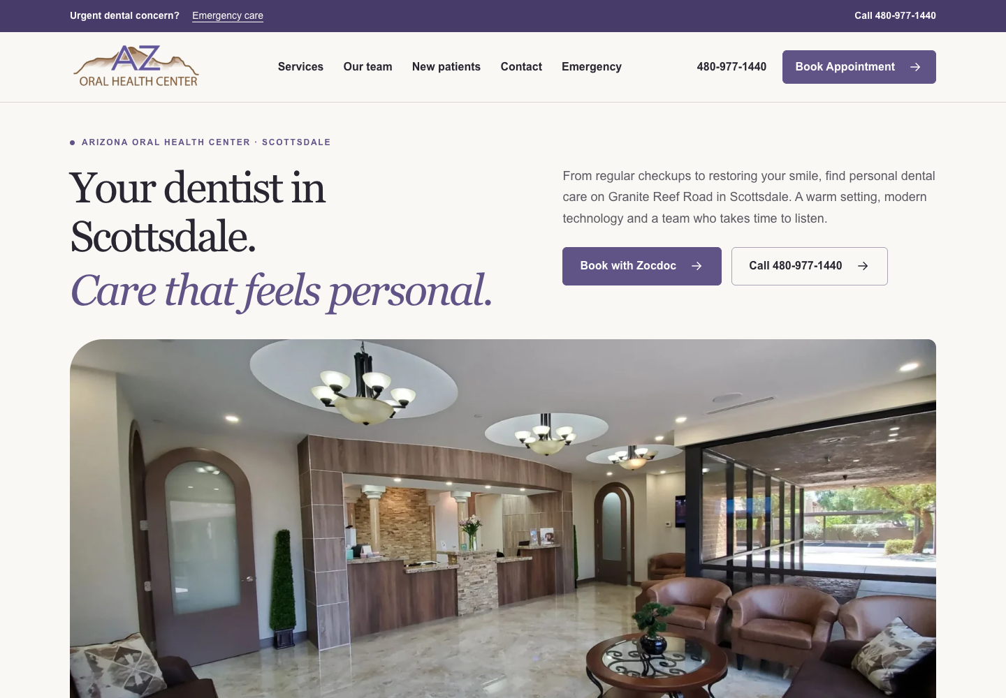
Arizona Oral Health Center
Modern dental website · Treatment content and phone/Zocdoc booking paths.
Improve the mobile experience customers use to read, compare, call, book, and inquire.
Book a strategy callSELECTED WEBSITES
Website design and modernization examples with clear services, useful content and practical customer paths.
Modern dental website · Treatment content and phone/Zocdoc booking paths.
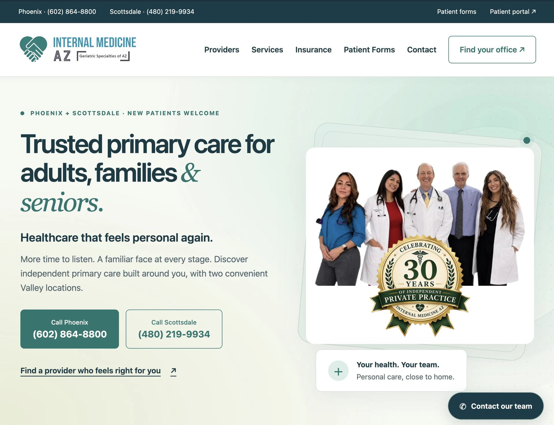
Modernized healthcare website · Phoenix + Scottsdale · SEO + AI-search foundation.
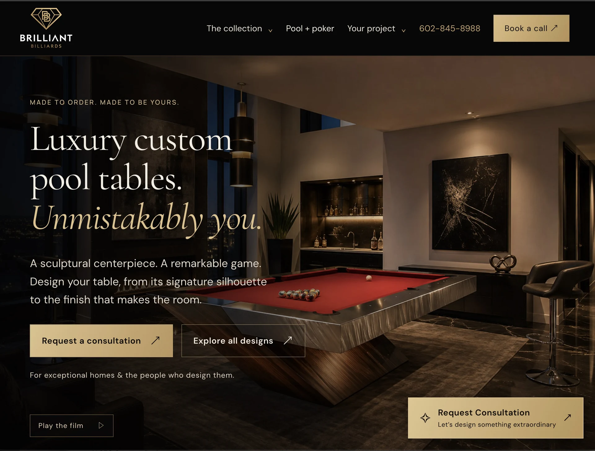
Custom pool table website · Product collections and consultation paths.
Explore the project images and visit the client websites. Screenshots capture a point in time; websites continue to evolve.
Explore the full portfolioWe follow a customer from a relevant service page to the next action. The review considers readable text, touch targets, menu behavior, image cropping, form fields, and the amount of scrolling needed to understand the offer. A layout that fits the screen can still be difficult to use.
Sticky navigation is useful when it keeps important actions available without covering content. We check menu states, anchor offsets, keyboard focus, and narrow screens rather than relying only on a resized desktop screenshot.
A mobile review begins with the page a customer lands on, not only the homepage. We follow a concrete task such as comparing a treatment, finding a service area or booking a consultation. Then we inspect the reading order, menu, fixed elements, touch targets, keyboard interaction and visible validation messages.
Arizona Oral Health Center’s case shows a clear example of differentiated next steps: phone and Zocdoc booking paths rather than an assumed working inquiry form. The right action depends on your operation. We test the selected journey in a controlled preview before release. Improvements are assessed through completed tasks and qualified outcomes, not button-click counts alone.
Priorities are selected around your business, your current website, and the opportunities we can substantiate.
Follow a realistic service-to-inquiry path on narrow screens.
Improve touch targets, field usability, hierarchy, and important next steps.
Compare relevant actions using consistent definitions and reporting periods.
PROGRESS WITH CONTEXT
Agree on useful measures before work begins: customer tasks, editing reliability, search reporting and qualified inquiries. Review the results together after launch.
Connect this work to your service priorities, the people maintaining your website and a monthly growth plan. Start with the assessment, agree the scope and review the results together.
No. A fixed control can help discovery but can also cover content, keyboard focus or form fields. We test its placement and usefulness on the pages where it appears.
Not necessarily. We identify whether the problems can be corrected within the current design system or whether the templates need more substantial work.
Yes. Bemo is based in Scottsdale and serves businesses across Arizona and nationwide. We agree on the collaboration process, access, and responsibilities for each engagement.
Your current website, the problems you want to solve, your priority services and markets, and any useful reports or examples. We identify any additional access needed after the initial review.
A CONVERSATION STARTS HERE